By Robin Murphy
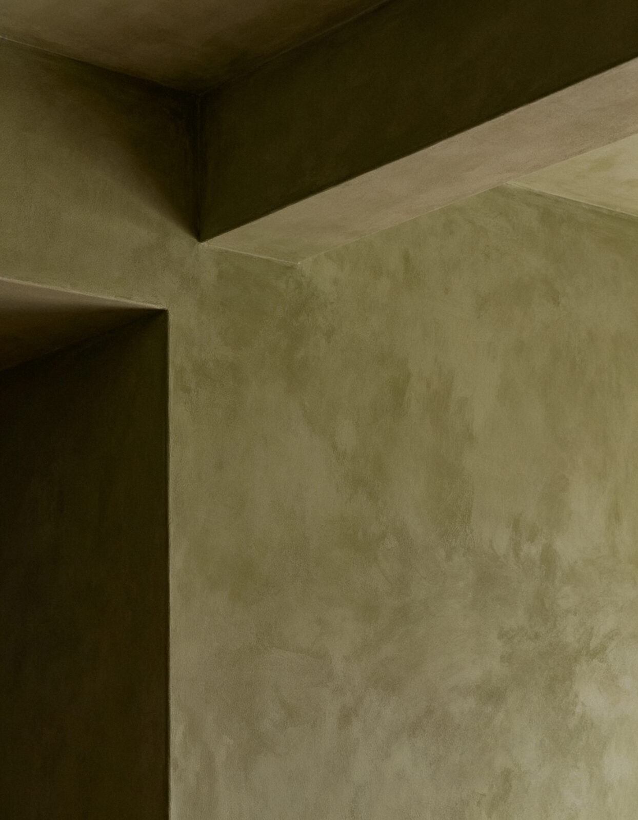
On August 26, Behr announced its 2027 Color of the Year. It’s green. More precisely, it’s an earthy olive green that can move toward moss depending on the light, with brown undertones underneath it.
But Behr didn’t call it Mossy Olive. It called it Grounded, which may be the more interesting part. Grounded doesn’t really tell you what the paint looks like. It tells you what the paint is supposed to do to you.
Behr says the color reflects a desire for homes that feel “rooted, lived-in and real.” The company talks about comfort, stability, restoration and reconnecting with nature. In a Behr-commissioned survey of 1,000 Americans, 77 percent said they turn to nature when life feels chaotic.
So this isn’t simply green paint. It comes with an emotional assignment, and once you notice that, the paint aisle gets much more interesting.
About a decade ago, Consumer Reports looked at how paint companies name their colors. Janet Davidson, then a marketing manager at Ace Hardware, explained that paint names used to be straightforward. Bright Red could simply be Bright Red. The goal now, she said, is to get consumers to connect with the color.
Apparently that connection can matter at the cash register. Davidson said that when people get down to their final few choices, “sometimes it’s a name preference that ultimately decides it.”
Which is kind of remarkable. Two colors can be sitting there on two little cards, close enough that you’re not entirely sure which one you prefer, and then one of them has the better story.
Paint companies have gotten very good at stories.
A 2018 study by Australian National University linguist Jan Tent examined 10,722 paint-color names from ten manufacturers in Australia and New Zealand. Sixty-two percent were classified as “enigmatic,” meaning the name itself gave essentially no useful information about the color. Another 31 percent were what Tent called “unorthodox descriptive.”
The names included Alcatraz, Anonymous, Dream I Can Fly, Mexican Standoff, Rumour Has It and Wot Eva. Good luck knowing what any of those look like without the paint chip.
But that’s really the point. The name no longer has to describe the color. It can give the color a personality, a memory, an attitude, or an entire imaginary life.
Green gives you information. Grounded gives you a story about yourself.
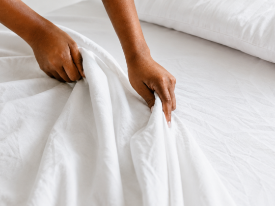
Whatever a bedroom color was originally meant to evoke, eventually it has to coexist with the bed that didn’t get made that morning. The living room wall becomes the wall behind the sofa. The hallway gets touched, the kitchen gets splattered, sunlight fades one section while a picture protects another.
Paint stops being an idea remarkably quickly once people begin living around it, which may be why I’m so interested in how much we ask of it beforehand.
We don’t just want a bedroom painted a particular color. We want it to feel peaceful. We want a darker living room to feel cozy, a bathroom to restore us, a kitchen to welcome us and a home office to somehow persuade us to concentrate.
The house has acquired an emotional job description.
Color is certainly part of how a room feels. A dark room is a different experience from a bright one, and color changes light, contrast and the way everything else in the room appears. But there’s still a considerable distance between changing the experience of a room and changing the person standing in it.
Paint marketing has become very comfortable living in that distance.
Even Behr sees a change in what we’re looking for. Kayla Kratz, the company’s head of color, told Domino that for the past few years, whites and beiges were largely where the decorating conversation located comfort. Now, she said, that idea of comfort is deepening into a pull toward earthen colors.
There’s another part of this shift that doesn’t show up on a paint chip: darker, earthier colors age differently once people start living with them.
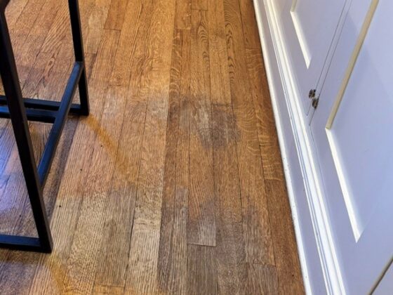
Cleaning is often when you notice what daily life has done to paint. People lean against it, brush past it, move furniture against it and touch the same light switch hundreds of times. Darker colors can show pale dust and lint more clearly, while matte finishes can develop shiny areas where they’ve been rubbed or wiped. Sometimes the mark you’re trying to remove disappears, but the wall still looks different because the finish has changed.
What interests me about the shift Kratz describes is that white and beige didn’t merely dominate walls for a while. They became part of a particular vision of home: bright, airy, clean, neutral.
Now moss, olive, brown and other earthier colors are arriving with words like rooted, restorative, stable, calm and real attached to them. Those aren’t really color words. They’re words about what we think we’re missing.
And that’s why lived-in is the part of Behr’s description I keep coming back to.
Aspirational home imagery has spent years removing evidence of actual life from the frame. You could look at a beautifully photographed room and see every object in it without learning much about the person who supposedly lived there.
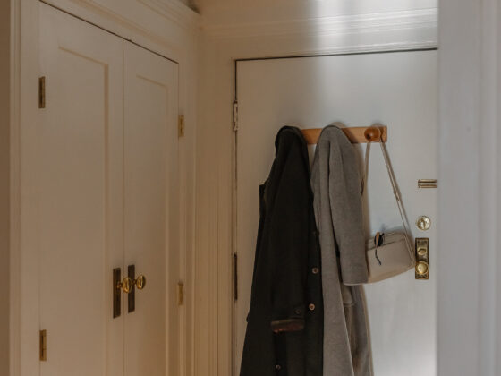
A lived-in house is different. People touch it, carry things through it, leave things out, wear things down and change their minds about it. Life keeps interfering with the decorating.
Maybe that’s part of the appeal of earthier colors now. They don’t seem to ask the house to float quite so far above ordinary life.
Or maybe it’s simpler than that. If the house is going to hold work, family, screens, pets, laundry, dinner, deliveries and a good portion of everything else that occupies us, we’d at least like the walls to look calm about it.
That’s a lot to place on a gallon of paint, but it explains why Grounded is a better name than Mossy Olive. Mossy Olive describes what Behr put in the can. Grounded describes what we hope might happen when we put it on the wall.
Of course, six months later, it won’t really be Grounded anymore. It’ll be the wall behind the chair, the place the afternoon light hits, the little scuff near the doorway, the section that stayed darker because a picture hung there.
The house will take the feeling we bought and turn it into evidence that somebody lives there.
The paint is green.
Grounded is what we’re hoping the house will do.